In the previous entry we train two advanced classifiers. In this entry we see another approach to an imbalance classification problem.
ROC curve: overview
Let us consider an imbalanced binary classification problem. The target variable $y$ takes only 0 or 1.
We can formally regard this classification problem as a regression problem and train a regression model $\hat p(x)$. Then given a sample $(x,y)$, $\hat p(x)$ will be near to 1 if $y=1$ and near to 0 if $y=0$. Therefore the model $\hat p$ gives rise to a classifier $f(x)$ in the following way:
$$\hat f_t(x) = I\bigl(\hat p(x) \geq t\bigr)$$
Here $I(p)$ is 1 if the statement $p$ is true, and 0 otherwise. $t$ is a threshold and we can use any real number as $t$ and the classifier $\hat f_t$ largely depends on the choice of $t$.
In this way we can create several classifiers by using different regression models $\hat p_1, \hat p_2, ...$. The problem is: How can we compare the classifier (or models)? The ROC (receiver operating characteristic) curve is often used for the comparison.
Fixing a threshold $t$, we have a classifier $\hat f_t$. After applying the classifier to samples, we compute the crosstab of our predictions and true values.
| $y=0$ | $y=1$ | |
| $\hat y=0$ | TN | FN |
| $\hat y=1$ | FP | TP |
Here TN (true negative), FN (false negative), FP (false positive) and TP (true positive) are counts of the samples in the corresponding cells. If we have a perfect classifier, then FP and FN are both zero.
If the threshold $t$ varies, then the numbers in the cells also vary. The ROC curve is just a curve of (FP rate, TP rate) parametrised by $t$. Here the FP rate and the TP rate are defined by
- FP rate = FP/(FP+TN)
- TP rate = TP/(TP+FN)
ROC curve: example
Let us look at an example of an ROC curve. We use the almost same data as the previous entry, the only difference is that the target column is not a factor vector. (The complete source code can be found in this repository.)
Let train a random forest model and make a prediction. The predicted values are real values (between 0 and 1). The classifier associated to the model says that a sample is likely to survive if the predicted value is greater than the threshold.
fit.ctrl <- trainControl(method='cv',number=5)
set.seed(1)
fit <- train(survived~.,df.train,method='rf',ntree=30,trControl=fit.ctrl)
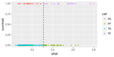
The scatter plot of the predicted values and the true values looks like the following.

In the above diagram the dashed line shows the threshold $t$ (=0.31). The points in "TP" (top-right) and "TN" (bottom-left) are correctly classified and others are not.
roc <- roc.curve(df.test$survived,predict(fit,df.test),plotit=F)
roc.df <- data.frame(thresholds=roc$thresholds,
                     FPrate=roc$false.positive.rate,
                     TPrate=roc$true.positive.rate,
                     diff=roc$true.positive.rate-roc$false.positive.rate)

df.tmp <- roc.df %>% slice(c(20,40,60,80)) %>%
  mutate(thresholds=round(thresholds,3))

ggplot(roc.df,aes(FPrate,TPrate,color=diff)) + geom_line() +
  geom_point(data=df.tmp,aes(FPrate,TPrate)) +
  geom_text(data=df.tmp,aes(label=thresholds),nudge_x=-0.04,nudge_y=0.04) +
  geom_segment(aes(x=0,y=0,xend=1,yend=1),linetype='dashed',size=0.05)

NB. roc.curve(df.test$survived,predict(fit,df.test)) is enough to draw the ROC curve.
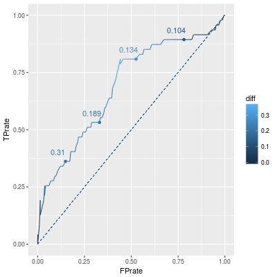
In the above line graph, annoted numbers are the corresponding thresholds. Since FP rate should be small and TP rate should be large, points in left-top correspond "good classifiers". Therefore points over the dashed diagonal line are better than points under the line.
(Moreover if we have a classifier corresponding to a point under the line, then the "reversed" classifier corresponds to a point over the line.)
As we mention, the actual classifier depends on the choice of the threshold $t$. One of the ways is to choose a threshold which maximise TP rate - FP rate. (This metric is diff in the above diagram.) From this viewpoint $t=0.1473459$ is the best threshold. (Note that this choise does not maximize F1-score. F1-score is a different performance metric.)
roc.df %>% arrange(desc(diff)) %>% slice(1:3)
##   thresholds    FPrate    TPrate      diff
## 1  0.1473459 0.4418605 0.8085106 0.3666502
## 2  0.1458259 0.4558140 0.8085106 0.3526967
## 3  0.1483503 0.4418605 0.7872340 0.3453736
Comparison of ROC curves: AUC
The ROC curve shows the metrics FP rate and TP rate for all thresholds. Our problem was: how to compare two models, or equivalently two ROC curves.
The area under the curve (AUC) is the metric which is used to compare two ROC curves. As we mention, points in left-top corresponds to better classifier, so a good ROC curve also goes near to the point $(0,1)$. The AUC of such a curve is naturally large.
The AUC is easy to compute. This is just the sum of the trapeziums. (We have already calculated: roc$auc.)
ysum <- roc.df$TPrate[-1] + roc.df$TPrate[-nrow(roc.df)]
xdiff <- roc.df$FPrate[-nrow(roc.df)] - roc.df$FPrate[-1]
0.5*sum(ysum*xdiff) ## AUC
## 0.6890153
A sampling method and AUC
In the last entries we see that a sampling method improves several metrics such as recall (=TP rate), precision and F1 score. In this entry we want to see how much a sampling method improves AUC.

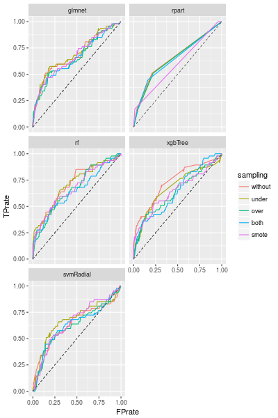
We are using the default configuration, therefore we can improve the models by adjusting the configuration (such as p for ovun.sample()). But the best sampling method clearly depends on the model we choose.
(We write the smote() function from scratch because DMwR::SMOTE() does not accept non-factor target variable.)
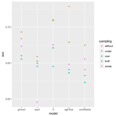
The AUC of each models are following. For random forest and XGBoost we do not need any sampling method, but for SVM any sampling methods work well.

Conclusion
A sampling method might not improve the AUC, it depends on the data and model. But it is worth trying it, if we do not have a model with a good AUC.

