

Convert a numerical variable into a categorical variable
We sometimes want to convert a numerical variable into a categorical variable. An easiest example would be age: function(x) ifelse(x < 18, 'young', 'adult)' converts a numerical variable into a categorical variable taking young or adult.
We loose some information by applying such a conversion, however it can be useful for understanding data and segmentation. (Moreover outliers could disappear.)
Let's see an example. We have one numeric feature variable x and a numeric target variable y. We want to convert x into a categorical variable.
library(caret); library(rpart); library(ggplot2); library(dplyr);
df <- iris %>% rename(x=Sepal.Length,y=Petal.Width) %>% select(x,y)
xs <- seq(from=4,to=8,by=0.01)
## linear regression
fit.lm <- lm(y~x,df)
beta <- fit.lm$coefficients
## segmentation by guess
seg <- df %>% mutate(xint=floor(x)) %>% group_by(xint) %>%
summarise(yhat=mean(y)) %>% rbind(data.frame(xint=8,yhat=2))
seg.guess <- data.frame(x=xs,xint=floor(xs)) %>% merge(seg,by='xint',all.x=T)
## segmentation by decision tree
tree.grid <- expand.grid(mincriterion=c(0.01,0.5,0.99),maxdepth=c(2))
fit.tree <- train(y~x,df,method='ctree',controls=ctree_control(maxdepth=2))
seg.tree <- data.frame(x=xs,y=predict(fit.tree,data.frame(x=xs)))
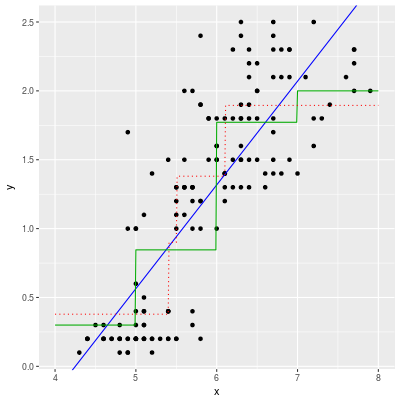
ggplot(df,aes(x,y)) + geom_point() +
geom_abline(intercept=beta[1],slope=beta[2],color='#0000ff') +
geom_line(data=seg.guess,aes(x=x,y=yhat),color='#00aa00') +
geom_line(data=seg.tree,aes(x=x,y=y),color='#ff0000',linetype='dotted')
The first impression would be that there is no need to convert x into a categorical variable. A linear regression (the blue curve) model seems enough to predict the values of y.
On the other hand, even if we decide to make a segmentation, it is very difficult to choose good segments. The green line is one of the possibilities. The boundary is x=5, 6, 7 and the height of the green line is just the mean value of y in each segment. This segmentation is less accurate than the linear regression.
The red dotted line is an automatically generated segmentation. (The boundary is x=5.55, 6.15.) This segmentation does not seem good, but in fact the segmentation is the better than the linear regression model.
## make a prediction
seg.guess <- df %>% mutate(xint=floor(x)) %>% merge(seg,by='xint',all.x=T)

RMSE(predict(fit.lm,df),df$y)    # 0.437 (linear regression)
RMSE(seg.guess$yhat,seg.guess$y) # 0.483 (segmentation by guess)
RMSE(predict(fit.tree,df),df$y)  # 0.407 (segmentation by tree)
Automatic segmentation by a decision tree model
When we convert a numerical variable x into a categorical variable xc (by looking at the numerical target variable y), xc must be useful/helpful for a prediction.
Let's make the criterion more concrete. Assume that there are $m$ segments $s_1$, ..., $s_m$. Denote by $\hat y_1$, ..., $\hat y_m$ the mean values of y in the segments. Then we obtain a simple predictive model, i.e. $\hat f (x) = \hat y_j$ if $x$ lies in the segment $s_j$.
Our requirement is: $\hat f$ is a good predictive model. Here "good" means that the RMSE on a training set and a validation set are both small.
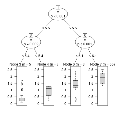
It is impossible to check all possible segmentations, but we have an efficient algorithm to find a good segmentation: Decision Tree (and its variant).
Leaves (terminal nodes) of a decision tree can be seen as segments and the prediction which the tree makes is nothing but the mean value of the corresponding leaf (segment).
The red dotted line in the above diagram is nothing but a decision tree regressor. We can easily find a good segmentation.
NB: This is not my original idea. I read an article explaining this idea a while ago. I guess this idea is well-known.
Another example of a conversion: Titanic dataset
The most famous non-trivial segmentation is probably bins of fare of Kaggle's Titanic competition. Namely we put fare into 4 bins: 0-9, 10-19, 20-29 or 30-.
Let's look at the scatter plot of fare and survived:
df <- PASWR::titanic3 %>% select(pclass,sex,fare,survived)
df <- df[complete.cases(df),]
(We use only complete rows for simplicity.)
set.seed(4)
in.train <- createDataPartition(df$survived,p=0.6,list=F)
df.train <- df[in.train,] # training set
df.test <- df[-in.train,] # test set

ggplot(df.train,aes(fare,survived,color=as.factor(survived)))+
  geom_point(alpha=0.5) + theme(legend.position="none")
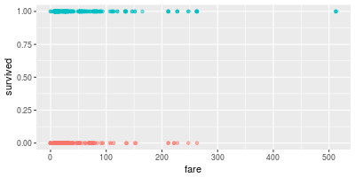
It is very difficult to guess a good segmentation by looking at the scatter plot. So we should look at the proportion of survived peoples in small bins:
df.train %>% mutate(survived=as.factor(survived)) %>%
ggplot(aes(fare,color=survived,fill=survived)) +
  geom_histogram(position = 'fill', alpha=0.4,binwidth=10) +
  geom_hline(yintercept=0.5, linetype='dotted', alpha=0.5) + ylab('proportion')
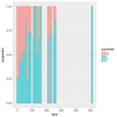
The above bar graph shows the porportion of survived people in small bins. The width of each bin is 10. So probably a good boundary would be fare = 20, 40.
Now we apply the model which is introduced in the Kaggle's tutorial.
into.bins <- function(x,boundary) {
  bdy <- sort(boundary)
  x.new <- rep(length(bdy)+1,length(bdy))
  for (i in length(bdy):1) x.new <- ifelse(x <= bdy[i], i, x.new )
  return(x.new)
}

seg.model <- function(df,boundary) {
  df %>% mutate(fclass=into.bins(df$fare,boundary)) %>%
    group_by(sex,pclass,fclass) %>%
    summarise(srate=round(mean(survived),3)) %>%
    mutate(yhat=ifelse(srate>0.5,1,0),
           key=paste(fclass,pclass,sex,sep='-')) %>%
    return()
}

seg.model(df.train,c(9.99,19.99,29.99)) ## Kaggle's model
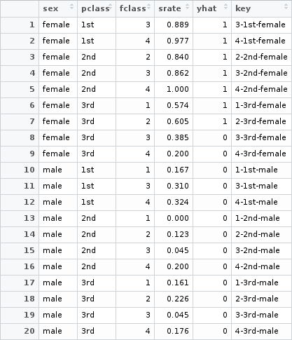
The model is simple. We use only three feature variables: sex, plcass and fclass. They are all categorical variables and there are 20 buckets (combinations of values). We compute the survival rate srate for each bucket. If the survival rate is larger than 0.5, then we predict that the people in the bucket are likely to be survived.
seg.accuracy <- function(df.train,df.test,boundary) {
  model <- seg.model(df.train,boundary)
  df.test %>%
    mutate(fclass=into.bins(df.test$fare,boundary),
           key=paste(fclass,pclass,sex,sep='-')) %>%
    merge(model,by='key',all.x=T) %>%
    mutate(yhat=ifelse(is.na(yhat),0,yhat)) %>%
    summarise(accuracy=mean(yhat==survived)) %>%
    return()
}

seg.accuracy(df.train,df.test,c(9.99,19.99,29.99)) ## accuracy of Kaggle's model
The accuracy of Kaggle's model is very good (0.7782) even though the model is simple.
Now let's try an automatics segmentation for fare by a decision tree model.
fit.tree <- train(survived~fare,df.train,method='ctree',
                  controls=ctree_control(maxdepth=2))
plot(fit.tree$finalModel)
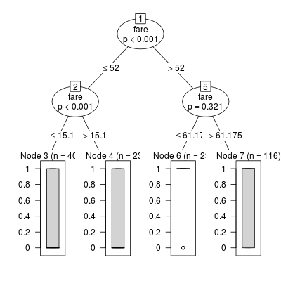
The segmentation is given by the above trained model. Unfortunately the automatic segmentation can not defeat Kaggle's model.
seg.accuracy(df.train,df.test,c(15.1,52,61.175)) ## the accuracy is 0.7590822
The most important boundary of Kaggle's segmentation is fare=20 and the decision tree algorithm fails to find the boundary.
Conclution
An automatic segmentation by a decision tree might be useful to create a simple model. In particular it is worth of trying an automatic segmentation if it is difficult to guess a reasonable segmentation by looking at the data.